ShopDreamUp AI ArtDreamUp
Deviation Actions


Suggested Deviants


Suggested Collections


You Might Like…


Description
Right.
So, once asked me for a step by step on my picture which is [link]
Baring it all, because it's also a good way for me to retrace my own steps.
Warning: I'm not the type who draw in a concise, simple manner. This one is especially worse than others. Welcome.
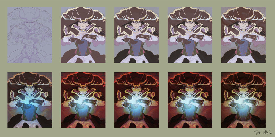
1) Lineart
I did it about 3; 4 times; from the roughest sketch using a big brush, then making a new layer and slowly and slowly using smaller brushes and creating more details (the corset took quite a lot of time.)
In the end I created 2 separate layers; a thick outer (generally) lineart, and the thinner one for details. If you noticed, I used different colors as well; that is the first time for me.
Insert one-two month gap here.
2) Base Color
I did it per basic color (hairs, her clothes, her coat + hat, the fur, her skin. The corset alone took 3 different layers).
I usually do it messily. Sloppily painting the basic colors and rendering it later. But the corsets and the evil, evil chains prevented me from doing so.
3) Shading
Trying to find out the shading; I used Multiply layer here. I'm also thinking about the direction and which spells to use. Basically, Storm Gust vs Lord of Vermilion = different colors = different lighting.
4) Highlight
Same as above; only with Overlay. I personally prefer Overlay than Lighten as far as highlighting are concerned, but...
5) More Shading and Highlighting
I ended up using Lighten after all. That, and Multiply. I'm a huge, huge hypocrite. >_> <_<
And let the magic begin!
6) Dark Arts 1 : Linear Light
Layer Style : Linear Light + Gradient Tool. I also tweaked some parts here and there to spread the lighting. At this point, the base lighting had appeared, hadn't it?
This is a happy, happy accident. I was just 'hmm let's try this-- WHOA I LOVE THIS YES THANK ALL THAT'S HOLY'.
7) Dark Arts 2 : Vivid Light
Layer Style : Vivid Light + Gradient Tool. I also tweaked some parts here and there to spread the lighting. It's more of an attempt to increase contrast, but using the standard Contrast adjustment is... a bit muh.
8) Dark Arts 3 : More adjustment
Layer Style : Overlay + Gradient Tool. This one layer was set in a very low opacity; 28%. I also tweaked some parts here and there to spread the lighting. Again, more contrast, adding more glow to the center.
9) More Shading and Highlighting
Now that I had a much clearer idea on how the picture should go, I added another Multiply + Lighten layer and created more depth. But I found that the overall picture is too...orange, and thus;
10) Dark Arts 4 : Color
Layer Style : Color. I overlayed the entire layer with a low opacity Color layer to make things less orange; to desaturate it a little bit.
And that's part one!
So,
once asked me for a step by step on my picture which is [link]Baring it all, because it's also a good way for me to retrace my own steps.
Warning: I'm not the type who draw in a concise, simple manner. This one is especially worse than others. Welcome.
1) Lineart
I did it about 3; 4 times; from the roughest sketch using a big brush, then making a new layer and slowly and slowly using smaller brushes and creating more details (the corset took quite a lot of time.)
In the end I created 2 separate layers; a thick outer (generally) lineart, and the thinner one for details. If you noticed, I used different colors as well; that is the first time for me.
Insert one-two month gap here.
2) Base Color
I did it per basic color (hairs, her clothes, her coat + hat, the fur, her skin. The corset alone took 3 different layers).
I usually do it messily. Sloppily painting the basic colors and rendering it later. But the corsets and the evil, evil chains prevented me from doing so.
3) Shading
Trying to find out the shading; I used Multiply layer here. I'm also thinking about the direction and which spells to use. Basically, Storm Gust vs Lord of Vermilion = different colors = different lighting.
4) Highlight
Same as above; only with Overlay. I personally prefer Overlay than Lighten as far as highlighting are concerned, but...
5) More Shading and Highlighting
I ended up using Lighten after all. That, and Multiply. I'm a huge, huge hypocrite. >_> <_<
And let the magic begin!
6) Dark Arts 1 : Linear Light
Layer Style : Linear Light + Gradient Tool. I also tweaked some parts here and there to spread the lighting. At this point, the base lighting had appeared, hadn't it?
This is a happy, happy accident. I was just 'hmm let's try this-- WHOA I LOVE THIS YES THANK ALL THAT'S HOLY'.
7) Dark Arts 2 : Vivid Light
Layer Style : Vivid Light + Gradient Tool. I also tweaked some parts here and there to spread the lighting. It's more of an attempt to increase contrast, but using the standard Contrast adjustment is... a bit muh.
8) Dark Arts 3 : More adjustment
Layer Style : Overlay + Gradient Tool. This one layer was set in a very low opacity; 28%. I also tweaked some parts here and there to spread the lighting. Again, more contrast, adding more glow to the center.
9) More Shading and Highlighting
Now that I had a much clearer idea on how the picture should go, I added another Multiply + Lighten layer and created more depth. But I found that the overall picture is too...orange, and thus;
10) Dark Arts 4 : Color
Layer Style : Color. I overlayed the entire layer with a low opacity Color layer to make things less orange; to desaturate it a little bit.
And that's part one!
Image size
3614x1800px 5.05 MB
© 2012 - 2024 font-street
Comments6
Join the community to add your comment. Already a deviant? Log In
Do you think you can make a tutorial for your style? It's just so great! It's amazing actually. How come? You should be extremely popular right now! You're such a great artist! You should get out around DA more! Seriously! When I first saw your style I expected you to be popular beyond belief! You're so good! I want to learn and understand your style!